 One of the easiest, and often little known tricks in all Studio versions since the product was released as Studio 2009, is the ability to move the windows around so that you can work in the way you want.
You can do this if you work with a single monitor or double monitors… or more! The basic idea is that you detach the windows in Studio and then just move them to where you like, either somewhere on your single monitor so that you can see the views that are more important to you on one screen, or by placing them onto a separate monitor altogether thereby maximising the screen real estate for your edting activity.
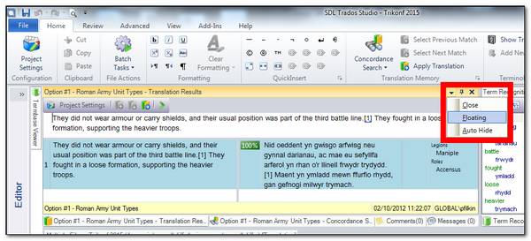
The process is this. First you undock the window you want somewhere else by clicking on the little drop down on the top right of the window you are interested in. In this case I’ve picked the TM Results Window:

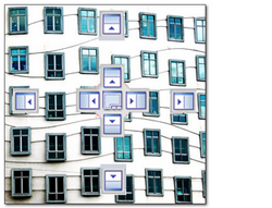
Once you do this and you move the window you floated you’ll see some navigation controls that allow you to move the window to different locations. This is actually pretty tricky to explain with pictures and text… a good example of where a picture doesn’t always paint a thousand words… or I need ten thousand which is sometimes thought to be the original quote. So I have created a short video further down this post that shows you how these controls work and what you can do.

But based on the image above you can see how there are basically two controls. The small ones numbered 2. allow you to drop the window onto the top, bottom left or right of the screen and take up the full width or height as you do so. The bigger control has all of these four controls in 2. and also a middle control. This larger control in 1. allows you to manipulate the window inside one of the other windows so you have tabs to access each one. It’s all getting a little wordy and complex now so best to visit the short video to get the idea.
And just in case you don’t have time for the video at the moment, here’s a couple or three examples of the sort of thing you can do.
Contents
Translation Editor, TM Results, Concordance Search, Term Recognition and Term Search all visible

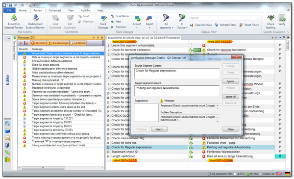
QA results window with Editor for easier reviewing

Second monitor… a bit of everything with the Translation Editor left on the main monitor!

And finally what may be the most important button of all… the Reset Window Layout , or in Studio 2014 it would be Alt+V then W.

If you move the windows around a lot and want a quick way to get to where you started then this is the button you want!
The more I do this the more I can see how useful it would be if you were able to save the different window layouts so they could quickly be called up when you wanted to work on particular task. Maybe a future enhancement!

This is in fact something what makes Studio unique on the market, as the main competitors I know do not allow to move any part of the program to a second (third, fourth) monitor. The ability to move windows makes me able to work with Studio at home on two >20″ screens, while when on the road I use a tiny 13-inches laptop and still am able to follow – having all the necessary information before my eyes.
Actually, both Fluency and OmegaT do something much like this I think, possibly others. But memoQ unfortunately not, except for the undockable preview. This is a very nice aspect of the software.
“if you were able to save the different window layouts so they could quickly be called up when you wanted to work on particular task”. Well, it’s possible to some extent. The layout you have when you close Studio will be there when you open it again, as part of the profile (which saves the windows layout). But of course, if you want different layouts, you need to have different profiles as well.
One nice feature you forgot to mention is that you can reset the positioning of just one window by double-clicking its title list.
Thanks Mats…. this is indeed the same as picking it up via the title bar as I showed in the video. But if you do this you don’t get the individual window, you get all the windows in that group. So if you just want the Translation Memory Results window without the Concordance, Comments and Messages then you have to use the little drop down.
I think we’re talking about different things here… you’re talking about moving the windows (by the way — when should we say “window” and when “pane” — not to mention “dialog” or “page”…) while I’m talking about getting them back into the original position. If you have moved several of them and just want one or two back, selecting the Reset window layout is no option, but double-clicking the title list(s) will do the trick.
Ah… After some more investigation I see that this is more complex than I thought (and maybe you showed it in your video but I missed it). I’ve been experimenting some more and am now more confused than ever. What happens when you double-click the title list seems to depend on several factors. I’ll be back when/if I find out more…
So… Some more exploration seems to show that double-clicking the title list toggles the position of the window between the two last positions, more or less (sometimes it gives surprising results — you can even double-click a list *before* you’ve moved the window, and it will jump to a position which to me seems totally random). I also discovered that right-clicking the title list give the same drop-down menu as double-clicking the down arrow — even if there is no down arrow there.
I think you’ve certainly uncovered everything there is to know about moving the windows around Mats. Good material for your updated manual!
Having watched the video and read the blog I had my layout all sorted out in 2014. But in 2015 I can move the windows about but only so that they are “sitting” on top of the editing window. I cannot work out how to adjust the size of the editing window….any ideas?
The only way is to minimise the ribbon and side navigation bar so the Edito takes up all the screen. Is that what you mean?
Hi Paul, sorry about the delay in replying. I have a screen layout that I am fairly happy with (I’d send a picture but cannot here) but what I wanted to do was extend the Term Recognition Window down from the top right of the screen to the bottom right of the screen so that the terms at the bottom are visible without scrolling. I have the Translation Results/Concordance window stretching across the bottom of the screen. I have not figured out how to do that and when I have attempted it all the windows seem to float about. I may just have to invest in another monitor.
Can you post it into the community where you can add an image?