 It’s funny how questions seem to appear like London buses… you don’t get any and then they all come at once! More often than not it’s very specific questions that behave this way too. So you don’t see them for ages and then you get the same question in a number of places for a day or two and then it goes quiet again! One of the topics that falls into this category is changing the view in the Editor. By this I mean the colour of the text, the font types or the background you’re working on. All these things can be changed in Studio to make it easier if you’re dealing with documents that don’t display well and you want to work in wysiwyg mode.
Since the release of Studio 2009 the things I’ll cover here have always been available through the options, but now that we have the ribbon in Studion 2014 it’s even easier. To make this easier to see (hopefully!) I addressed where the options are in this article and then I recorded a short video so you can see in one go how these work in practice. This is the text I’m working with, “theview“, which is obviously a deliberately prepared file containing some things that can make it very difficult to read and work with when working in the default view and you can download it to have a play if you like.
But first lets see where all the options are.
Contents
File -> Options – Editor -> Font Adaptation
This location is the main view for changing related settings in the Editor.

In here you have two main groups that relate to how fonts and text colours can be handled to make them easier to work with.
Adapt Font Sizes
This setting, when enabled, gives you the ability to control the maximum or minimum font size for the source and/or target text. This only affects the view in the Editor, it does not affect the target translation at all.
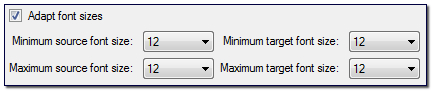
The ability to control the source and target separately is very neat because the font that is used for some languages by default (mostly Asian) can vary in size, so when working with the defaults you can have a large source and and difficult to read target, or maybe the other way around. Changing the target to be larger to suit your eyes can level this up. It also means that the font will be consistent in size without losing the rest of the wysiwyg capability.
Adapt text colors
This setting, spelt with the American “colors” which makes me think it’s a typo every time I look at it, is a little known feature, but very handy:
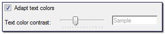
This setting can automatically adjust the contrast between the font and the Editor background to make it easier to see fonts that would otherwise be lost. This becomes more clear (excuse the pun) when you watch the video at the end.
Using the Ribbon
Since SDL released the 2014version of Studio it’s also possible to access these settings through the ribbon in the View menu. The Font Adaptation group is tucked away at the far right and will look something like this depending on the size and resolution of your screen… so you may see it more clearly than I do on my laptop:
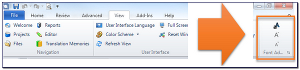
This is pretty cool because you can quickly switch off the wysiwyg font sizes by clicking on this ![]() . You can then use the large A to make all the font larger, or the small A to make it smaller.
. You can then use the large A to make all the font larger, or the small A to make it smaller.
If you click on the little “dinky” at the bottom right of the group, (the little arrow going down left to right) ![]() , then you are taken directly to the Font Adaptation settings we discussed above.
, then you are taken directly to the Font Adaptation settings we discussed above.
Formatting Display Style
I’ve added this one in here because this is also an important feature that allows you to quickly remove the wysiwyg display altogether and always work showing plain text and all the tags. Many translators always work in this mode and when you do this all issues around formatting, colours, tags etc. disappear. You can find this option in File -> Options -> Editor:
![]()
There are three settings for this but the one shown here is the only one to remove all formatting. I have discussed this before with regard to tag handling so for a more detailed dicsussion of this one take a look at this article.
File -> Options -> Colors
If none of the options above are working for you then you also have another option and this is to change the default colours in the view itself. The options here are a little limiting in respect of this article, but you can make fine adjustments that might be helpful for you if all else fails and you are looking for a very specific way to view the text and colours. In here it’s really the top three that are going to be the most helpful I think… but take a look at all the options as there are some things you can do here for other reasons that you may not have known about:

The Background color will change the colour of the Editor view entirely, similarly with the Text color. This might be useful for users with some sight difficulties. So you could completely change the display to be a blackground with white text for example… I’ll show this in the video. The choice of colours in here is quite limited for may well be adequate for your needs. The Active segment background color only changes the colour of the segment you are working in. This may similarly be useful as it allows you to set up a better contrast to suit your needs.
But the best solution for all of these is to have a play… you won’t break anything and you can always hit the Reset to default in each settings pane if you completely mess it up!
Hi, yes if you haven’t used those settings, they definitely can make things easier to read and type.
On a related note, I really liked the “Show whitespace characters” option under “File -> Options -> Editor-> Side-by-side Editor” as it makes it easier to see when you have extra spaces at the end or a double space somewhere.
However, there is one fatal flaw in that setting, when you turn “Show whitespace characters” on, it makes U+0020 (Space) and U+3000(Ideographic Space) look exactly the same! So, unfortunately I cannot use that setting because of this issue.
Interesting… I’d never tried that before. I can see how Word has a different display though… wonder why Studio doesn’t? I’ll ask the question.
Hi Jesse, can you give me a practical example of when you need to be able to see this difference? It looks like a significant amount of work to do this and as we’ve been around for years without anyone ever bringing this up we’re wondering why now?
I think this might be an issue only for people who work with CJK languages (I’m not 100 percent sure though). In my case, I have a Japanese Input Method Editor (IME) to type Japanese. When I am in Japanese mode and hit the space bar, a U+3000(Ideographic Space) is typed instead of the normal U+0020 (Space). It is a very common mistake to mix the two types of spaces because you forgot which input mode your were using, etc. Now, this type of mistake can be easily picked up by adding a check item to the QA, but it would be also nice to visually see those mistakes while you are typing.
Great blog, Paul. Funny…”colours” always looks like a typo to me!
My workspace 🙂
https://www.dropbox.com/s/tneoiwe9re39e8h/%D0%A1%D0%BA%D1%80%D0%B8%D0%BD%D1%88%D0%BE%D1%82%202015-03-14%2015.52.12.png?dl=0
Looks pretty clear!
Hi Paul! Is there any way to prevent Studio from using a lighter and a darker shade of the colour I select for the background of adjoining segments? (In other words I would like to select one colour and always have that particular shade for the background colour of the active segment as I move from one segment to the next.)
Thanks.
Hi, good question. The only way I can see to do this is ny choosing a darker colour for the active segment background. When I do this it seems to stay the same as I traverse the translation. But if you want to keep the light powder blue then I can’t see a way to do this.
Ok, thanks. The funny thing is I never noticed they alternate when I was using the default blue, I became aware of it only after I modified the background colour to one that I liked a lot and was very disappointed to see it change when I hit Ctrl+Enter. I’d venture to say that this behaviour of Studio is not very reasonable – more of a bug than a feature. It makes sense for the background of non-active segments to alternate (between white and pale grey, with the default settings), but having it alternate for active segments cannot serve any purpose at all, for the simple reason that you can never see two active segments at the same time.
I reaaally dislike SDL, but thank you much for your explanation!
Editor perfectly clear and settings done. BUT (there is always a but) the whole text on Home tab, Confirmation Statistics window, Report etc. are of MICRO size. Tried to change resolution of Windows 11, enlarge font and icons etc. but nothing helps in SDL Trados 2022.
Kind of desperate looking for help (Murphy never sleeps, so there are dozen projects I have to finish in notime..)
Thank you all for any ideas…
Hi Sonja, I’d recommend you post these questions into the RWS Community so the developers can see your problem.